Tuesday, September 30, 2008

OOH campaign for Sprite Xpress

Coca-Cola is using eye catching outdoor creatives for the product communication. This includes innovative 3D graphics on various outdoor structures.
  • A sticker on a glass door looks like a Sprite Xpress bottle is breaking through the door
  • Another like the bottle is breaking through the building
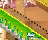
  • Stickers on escalators look like people coming down the escalator are holding bottles of Sprite Xpress
  • On truck backs, the 3D graphics make it seem like Sprite bottles are falling off the back of the truck
  • On conveyor belts, a 3D sticker seems like a crate of Sprite Xpress is moving on the belt.
  • Sprite Xpress Crate handbags make it look like a person is carrying a crate of Sprite Xpress when they hold the handbag.
The tagline for the campaign is: ‘Sprite Xpress Ghumo Ghumao?!’


“The mobility factor of the product is the big idea behind Sprite Xpress. It’s more of a ‘package’ communication, focusing on the new packaging. In the tagline, ‘Ghumo Ghumao’, the word ‘Ghumo’ represents the take it anywhere quality of the product, and ‘Ghumao’ is an attribute of today’s go-getter youth, which symbolises clarity of thought and smartness.”

The Sprite Xpress 350 ml pack will also be made available in Coca-Cola, Diet Coke, Thums Up, Maaza and Kinley Club Soda in the first phase. In the second phase, Fanta, Limca and Minute Maid Pulpy Orange will also be available in this packaging.

Agency : O& M

Monday, September 29, 2008

ASIA BRAND CONGRESS 2008 - SNIPPETS

Earlier, brands followed this relationship pattern: You→Your Brand→Consumer. But ideally, they should follow this: You→Consumer→Their Brand. “Lovemarks are not purchased, they are owned. If you take a brand away from a consumer, he will replace it. If you take a Lovemark away, he will protest.”

Brands that command high respect (performance, trust and reputation) and great love (mystery, sensuality, intimacy) achieve Lovemark status. Even some people such as Mother Teresa or Sachin Tendulkar are Lovemarks. In the brands context, some Indian Lovemarks include Amul, Britannia, Cadbury, Horlicks and Vicks.

“Brooke Bond Red Label tea is a Lovemark that faded away, It is relatively easy to get people to fall in love with you… it’s tougher to get them to stay in love.”

A brand such as Starbucks is an international Lovemark, all because of its approach. Starbucks believes it is in the people business, serving coffee, and not in the coffee business, serving people.

This is a complete antonym to the 360 degree communication jargon. “That is all bullshit,”. “360 is all about surrounding people and attacking them from all sides… let’s not forget that we are in the attraction economy and not just the attention economy any more.”

Further, things are moving away from return on investment to return on involvement, from product performance to total experience. Marketers are to generate emotion, rather than get people to listen to reason because “emotions lead to actions, while reasoning only leads to a conclusion”.

“If your spouse tells you that he loves you a million times in a day, chances are that at some point, you will get irritated. Advertising is becoming like that. Let’s not forget, love is about doing, not saying.”

“In order to connect with the mindsets of people around the world, you must learn what their aspirations are, what their psyche is, what their outlook is. You must know about their lifestyle so that you can connect with them on the same wavelength,”

Saturday, September 27, 2008

India post and the new logo


Creative agency: O & M
Management consultant McKinsey is behind the restructuring of the Department of Posts.

The new logo is designed in red and yellow. At first glance, it appears to be an envelope. A closer look reveals the bold strokes which give the impression of a flying bird. Though there has been a departure from the straight lines in the earlier logo, a certain element of continuity can be seen. The wings, which act as the anchoring element, have been retained, but the treatment is different.

Red has been chosen for its traditional association with the postal service. The colour also embodies passion, power and commitment. Yellow communicates hope, joy and happiness. India Post embraces a change to present itself as a vibrant and dynamic organisation with a modern approach.
“Hopes, dreams and aspirations are the basis of this logo. When they soar, anything can be achieved. That’s why the wings have been added to the new logo of India Post.

The line, ‘Giving Wings to Your Dreams’, summarises the philosophy of India Post.
The modernisation of post offices is a part of Project Arrow.

Bindass hangs a cab in the sky


Bindass, the youth entertainment channel from UTV, has launched a game show on wheels, Airtel Bindass Cash Cab, which went on air on September 15 at 7.30 pm. To promote the show, the channel actually put up a cab on a hoarding in Mumbai's prime advertising location, Mahim Causeway.

To win the money, the passenger must give the right answers to the questions asked by the ‘Cash Cab Haryanvi Jat driver-cum-anchor’, Munish 'Munna' Makhija.

The questions get progressively challenging and the cash increases apace. Incorrect answers get a strike and three such strikes get the passenger out of the cab, irrespective of the distance remaining to his destination.The passenger also gets two lifelines to help him when he doesn’t know the answer to a particular question. He can either call a friend or stop the cab and pose the question to someone on the road. Currently, the cab is running in Mumbai and Delhi, but will be taken to Kolkata and Bengaluru soon. The international format of the show has won an Emmy award.